Chapter 1 Mapping data
In this section, we will introduce how to map and visualise spatial data in R. It will introduce you to the key R packages for wrangling and plotting spatial data, and demonstrate how to use them for different data types. The lecture slides for this practical can be found here: powerpoint or pdf.
1.1 Why map?
Geography is the lens at which we view the World. Through exploring how health outcomes vary between neighbourhoods, cities or regions, as well as their drivers, we can start to piece together the underlying processes affecting health. Visualisations allow us to make data ‘real’ and can give us an intuitive sense of what is going on. Maps are data visualisations that have an inherent spatial dimension to them.
1.2 Mapping in R
There are several R packages that allow us to map and visualise data within R - too many to cover in just one module! Here we will focus on the three main packages for mapping vector data. Raster data are less common in public health, social science and health-related data science (satellite-derived measures, such as green space coverage or sensor estimated pollution, are the exceptions here). As such, we will not cover how to map them here. You can review the lecture slides over these data types here. In brief, vector data refer to points, lines or polygons (shapes representing areas)
First, we have sf (Simple Features) which provides allows R to engage with spatial data and therefore is key for any wrangling of spatial data we need to do. Through base R’s plot() command, we can map data. We need sf for most spatial packages or commands, so it is core here. I find plot() somewhat restrictive in designing pretty or engaging visualisations. It is quick to run and requires minimal code, so often offers a ‘first pass’ at looking at the data
Second, ggplot2 (Grammar of Graphics for Plotting v2) is one way of plotting data and producing professional-style visualisations. Plots are built sequentially, adding features one line at a time. It can be a bit ‘fiddly’ to learn, but once you understand how it works it can offer a great deal of customisation. We will focus on ggplot2 for most of our tutorials.
Finally, tmap (Thematic Maps) is a package built primarily for mapping spatial data. The format follows a similar style to ggplot2. I find it easier to use for creating quick maps, but is less flexible than compared to ggplot2 when changing specific aspects of plots. It is probably personal perference which you will end up using.
We will now go through how to use these packages to plot different types of vector data to sneak in introduce the key concepts of mapping.
1.2.1 Areas
We first start with mapping data for areas. This may include information on neighbourhoods, cities, regions or countries - much health data is made available for areas and so this is a useful way of visualising health data. Data on individuals are often aggregated to geographical zones to make sure they are less disclosive as well.
Spatial data are not stored in common data formats we may have encountered elsewhere (e.g., csv or text files). They require formats that can recognise their spatial nature, so that we can plot their geographical patterns clearly. One of the main types of storing spatial data are shapefies (.shp and associated files). Other file type formats for vector data include .GeoJSON (Geographic JavaScript Object Notation), .gml (Geography Markup Language), .kml (Google Keyhole Markup Language) and .gpx (GPS eXchange Format). We will stick with shapefiles for the purpose of this tutorial.
Let’s have a look at some area data. We will load in small areas for Liverpool, specifically Middle Super Output Areas (MSOAs). MSOAs are statistical zones ucreated for the purpose of mapping administrative data. They represent ~7500 individuals and therefore represent large neighbourhoods to small towns/large villages. For most Census-based UK shapefiles, we can find them at UK Borders. You can find the data themselves stored in the Shapefiles folder. We will also load the R package sf so that R can handle these data.
library(sf) # Load in sf package## Registered S3 methods overwritten by 'tibble':
## method from
## format.tbl pillar
## print.tbl pillar## Linking to GEOS 3.7.2, GDAL 2.4.2, PROJ 5.2.0msoas <- read_sf("./Shapefiles/Liverpool_MSOAs/england_msoa_2011.shp") # Load in shapefileYou may have noticed that we only need to load in a single file - the shapefile - and not the other files in the folder. This is because they each store supplementary information that helps R know how to interpret the shapefile (e.g., the projection of the data).
Vector data are plotted based on their coordinate reference system (CRS). The CRS gives the spatial location of the data we are plotting. These are typically points and through joining up points we can create lines or polygons. They usually have two values representing the ‘x’ (longitude - the East to West location with respect to the distance from the ‘Prime Meridian’) and ‘y’ (latitude - the North to South location with respect to distance from the ‘Equator’) values of where they are.
How ‘distance’ is measured is important and is what the CRS tell us. As the World is ellipsoidal (it is not quite spherical), and our computer screens are flat we need to tell R how to convert these values between the two formats. Essentially, we need to use projections to convert the three-dimensional geographic location onto a two-dimensional device. This process leads to some distortion of area size, direction, distance or shape. Selecting an appropriate projection is therefore important for plotting data and avoiding misleading visualisations. Different countries have different preferred projections.
Fortunately, most spatial data is provided with a CRS. Using sf we can identify a CRS using st_crs().
st_crs(msoas)## Coordinate Reference System:
## User input: 27700
## wkt:
## PROJCS["OSGB 1936 / British National Grid",
## GEOGCS["OSGB 1936",
## DATUM["OSGB_1936",
## SPHEROID["Airy 1830",6377563.396,299.3249646,
## AUTHORITY["EPSG","7001"]],
## TOWGS84[446.448,-125.157,542.06,0.15,0.247,0.842,-20.489],
## AUTHORITY["EPSG","6277"]],
## PRIMEM["Greenwich",0,
## AUTHORITY["EPSG","8901"]],
## UNIT["degree",0.0174532925199433,
## AUTHORITY["EPSG","9122"]],
## AUTHORITY["EPSG","4277"]],
## PROJECTION["Transverse_Mercator"],
## PARAMETER["latitude_of_origin",49],
## PARAMETER["central_meridian",-2],
## PARAMETER["scale_factor",0.9996012717],
## PARAMETER["false_easting",400000],
## PARAMETER["false_northing",-100000],
## UNIT["metre",1,
## AUTHORITY["EPSG","9001"]],
## AXIS["Easting",EAST],
## AXIS["Northing",NORTH],
## AUTHORITY["EPSG","27700"]]You can see that the CRS used is 1936 British National Grid - a common CRS for files from Great Britain. To re-project any spatial data to a specific CRS, we can use the following command st_transform().
Let’s plot the spatial data usig sf and plot().
plot(msoas)
Here we can see each MSOA’s location in Liverpool. Three maps are presented - one for each column in the shapefile. This is one reason why plot() is not useful, since it will just plot everything. Here is it is just plotting the descriptors of each MSOA (name = name of MSOA, code/label = unique code of MSOA). You can inspect the data yourself through using head(msoas).
Mapping the MSOAs themselves is a little boring, so let’s join on some data. We will map COVID-19 vaccine uptake data for Liverpool - specifically the numbers of people who had receiveda vaccination between 8th December 2020 to 6th June 2021. The data are open and can be found here. I have cleaned the original file and saved it in Data folder. The variables we have are:
- msoa_code - unqiue code for each MSOA
- msoa_name - the name of each area
- total_first_dose - the number of people who received their first COVID-19 vaccine dose
- total_second_dose - the number of people who received two COVID-19 vaccine doses
We will now load in the data and join it onto the shapefile. To do the latter step, we will need to join on a common identifier - in this case MSOA code as it is unique and allows us to assign a one-to-one match between datasets. The merge command can join together files, as long as we tell R on what files to join based on (i.e., which columns are the MSOA codes found).
vaccine_uptake <- read.csv("./Data/msoa_vaccine_10June21.csv") # Load in vaccine uptake data
msoas <- merge(msoas, vaccine_uptake, by.x = "code", by.y = "msoa_code", all.x = TRUE) # Merge the vaccine uptake objects onto the msoa object, based on the columns defined (x = msoas, y = vaccine_uptake), and do this for all observations only in the x (msoas) objectYou should always quickly check whether it worked. I usually run a brief head(msoas) check to see if it works.
First, we will plot the number of people who have received their first dose of the COVID-19 vaccine. We will do this using ggplot2
library(ggplot2) # Load in package
map1_1 <- ggplot() + # Call ggplot command
geom_sf(data = msoas, aes(fill = total_first_dose)) # Using a spatial object, plot MSOAs and fill in based on number of people with first COVID-19 dose
map1_1 # Print plot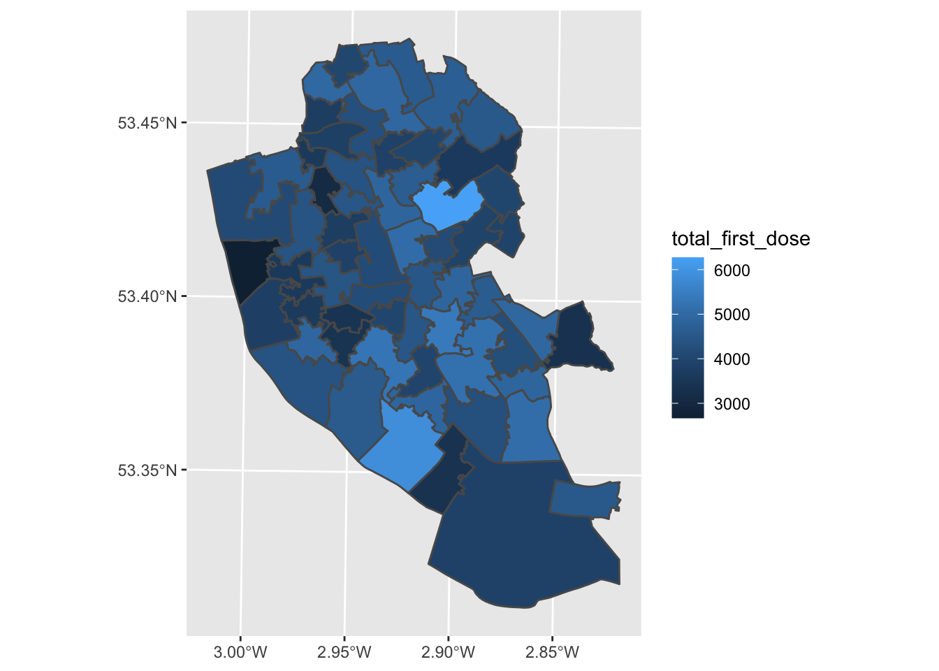
Well done - you’ve made your first map! What patterns can you see? What might explain these patterns?
We can edit the map to make it nicer, how about trying the following options. Remember that ggplot adds each feature line-by-line, so the order of your code sometimes matters to how it is plotted.
library(viridis) # For colour blind friendly colours## Loading required package: viridisLitemap1_1 <- ggplot() + # Call ggplot command
geom_sf(data = msoas, aes(fill = total_first_dose), lwd = 0) + # Using a spatial object, plot MSOAs and fill in based on number of people with first COVID-19 dose, with line width = 0 (i.e., not visible)
scale_fill_viridis_c(option = "plasma") + # Make colour-blind friendly
xlab("Longitude") + # Add x-axis label
ylab("Latitude") + # Add y-axis label
labs(title = "First dose COVID-19 vaccinations", # Add title to map
fill = "Frequency") # Edit legend title
map1_1 # Print plot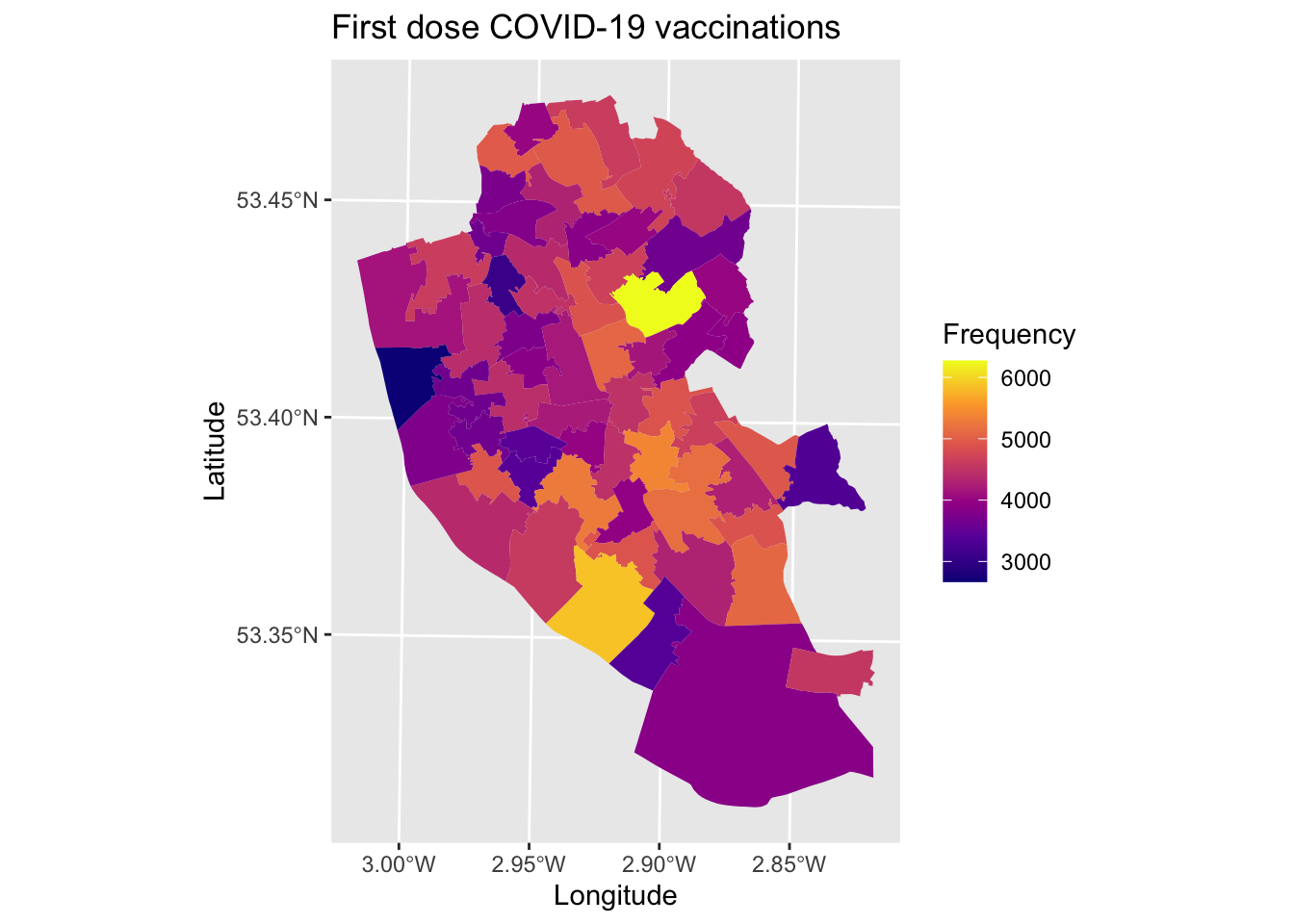
Why not try editing some of the values above and see how it changes the aestheics of the map.
To save the map, we use the following.
ggsave(plot = map1_1, filename = "./Plots/map1_ggplot.jpeg", dpi = 300) # save## Saving 7 x 5 in imageWe next move onto plotting using tmap. Here we will plot the number of people who have had two doses of the COVID-19 vaccine.
library(tmap) # Load package
map1_2 <- tm_shape(msoas) + # Call which spatial object
tm_polygons("total_second_dose") # Which column to plot
map1_2 # Print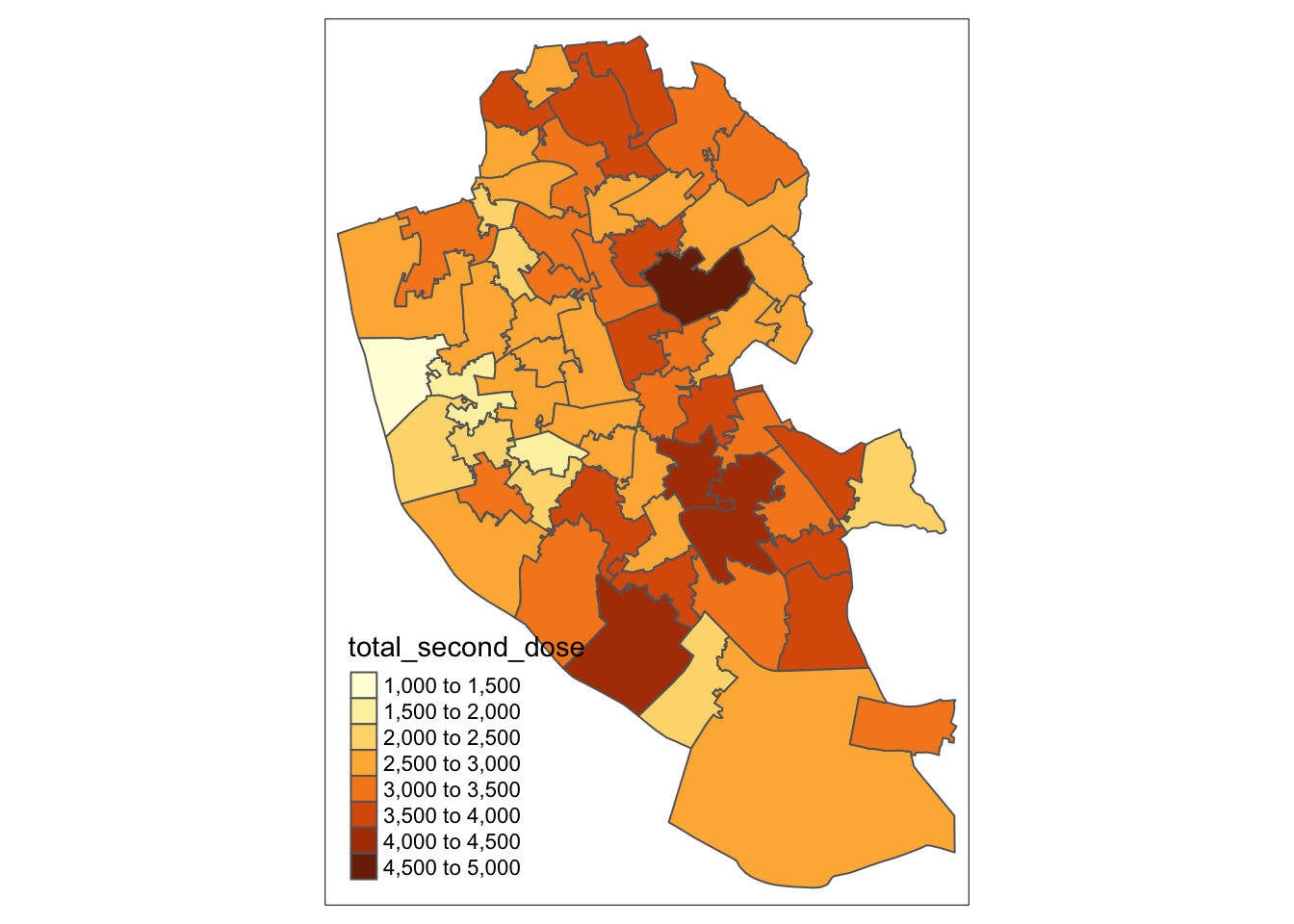
Just as easy to use! Again, let’s make the map prettier. We can also add in a few other common map conventions including a north arrow and a scale bar far easier with tmap. Note: calling viridis here can be a bit temperamental, and may need you to reload the package before running the code.
map1_2 <- tm_shape(msoas) + # Call which spatial object
tm_polygons("total_second_dose", palette = "viridis", title = "Frequency") + # Which column to plot and plot using colour blind friendly colours and edit legend to 'Frequency'
tm_layout(main.title = "Second dose uptake") + # Add title
tm_scale_bar(position = c("right", "top"), width = 0.15) + # Add scale bar
tm_compass(position = c("left", "top"), size = 2) # Add north arrow
map1_2 # Print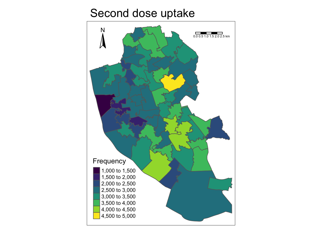
To save the map, we do the following.
tmap_save(map1_2, filename = "./Plots/map2.jpeg", dpi = 300) # Save file## Map saved to /Users/markagreen/Documents/GitHub/spatial_data/Plots/map2.jpeg## Resolution: 1789.97 by 2463.729 pixels## Size: 5.966566 by 8.212429 inches (300 dpi)And there you go - just like that you have learned how to plot in R using three different packages! Easy.
1.2.2 Points
The next type of data we will consider are points. The area polygons we have just mapped are really a bunch of points connected by lines, so they are the building blocks of spatial data. However, they offer value by themselves for representing specific spatial positions (e.g., locations of health services).
Point data may be supplied in a spatial data format, or can just be provided as a text/csv file with a list of spatial points recorded within. The latter format can make them a little easier to handle, although since they are missing their CRS we will need to define it ourselves.
Let’s have a go at plotting some points. We will stick with the COVID-19 vaccination theme here. During the initial roll-out of vaccines, Liverpool City Council funded a ‘vaccination bus’ that could travel around Liverpool and make getting a vaccination more accessible (i.e., people could just turn up and get vaccinated there and then). Let’s have a look at the areas they brought the bus to.
To load in the point locations of where the bus traveled to, we can treat the data as a standard data frame in R.
bus_locations <- read.csv("./Data/liverpool_bus_locations.csv") # Load dataIf we use head(bus_locations), we can inspect the data. It includes the following variables:
- site - name of the location visited
- longitude - the spatial location, as measured east-west of the Greenwich Meridian point
- latitude - the spatial location, as measured north-south of the Equator
- postcode - the postal address of the site (note that postcodes are not unique and may represent 15 households)
- location - latitude and longitude combined into a single geometry point
The data is currently stored in a data frame format. We need to tell R that it is actually spatial data, so that it can plot it as such. sf can help us here.
# Convert to spatial data frame
bus_locations_sp <- bus_locations %>% # For object (bus locations)
st_as_sf(coords = c("longitude", "latitude")) %>% # Define as spatial object and identify which columns tell us the position of points
st_set_crs(4326) # Set CRSLet’s look at where these points are located. First, we will use ggplot2.
map1_3 <- ggplot() + # Call ggplot command
geom_sf(data = bus_locations_sp, colour = "green") + # Plot points as green dots
xlab("Longitude") + # Add x-axis label
ylab("Latitude") + # Add y-axis label
labs(title = "Location of vaccine bus") # Edit legend title
map1_3 # Print plot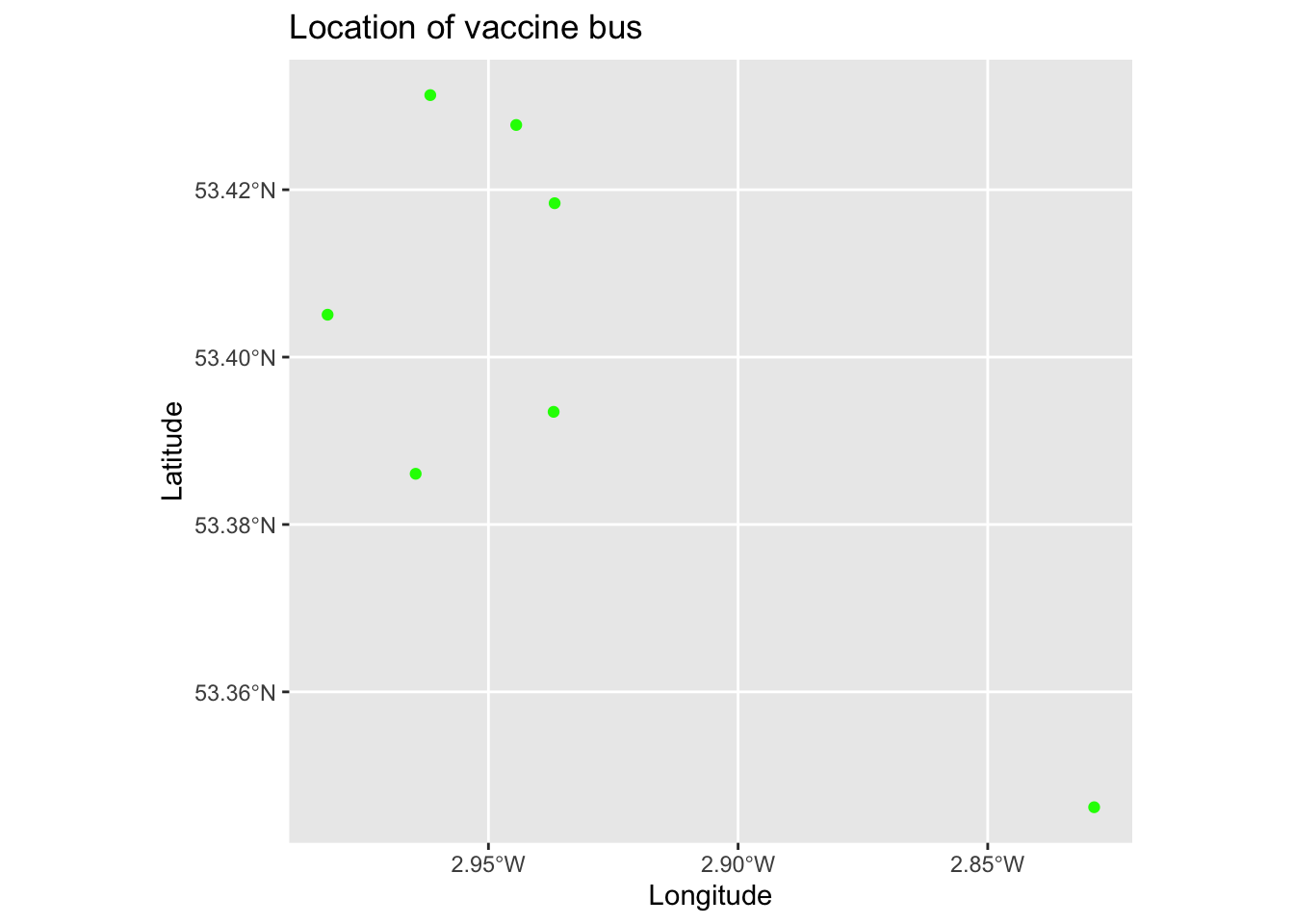
Hmmmm, that is not particularly useful by itself. Let’s add these points to the map of vaccine uptake that we made earlier. This will help us tell if the locations were targeted at areas with low or high uptake. Note that we call the points after the area data, since ggplot2 builds the plot sequentially, this helps to ensure the points are plotted on top of the area data.
map1_3 <- ggplot() + # Call ggplot command
geom_sf(data = msoas, aes(fill = total_first_dose), lwd = 0) + # Plot vaccine uptake (1st dose)
scale_fill_viridis_c(option = "plasma") + # Make colour-blind friendly
geom_sf(data = bus_locations_sp, colour = "green") + # Plot points as green dots
xlab("Longitude") + # Add x-axis label
ylab("Latitude") + # Add y-axis label
labs(title = "First dose COVID-19 vaccinations", # Add title to map
caption = "Green dots are locations of vaccine bus", # Add description to bottom of map (alternatively could place as subtitle = "" too)
fill = "Frequency") # Edit legend title
map1_3 # Print plot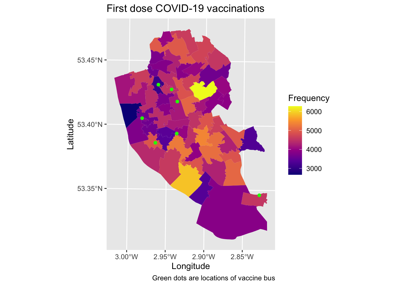
How useful do you think the vaccine bus locations are? Do you think this approach is helpful? How might you improve or better target their locations?
We can do the same using tmap too. We next recreate the same map from earlier (2nd dose uptake) and compare it to vaccine bus locations.
map1_4 <- tm_shape(msoas) + # Call area data object
tm_polygons("total_second_dose", palette = "viridis", title = "Frequency") + # Which column to plot and plot using colour blind friendly colours and edit legend to 'Frequency'
tm_shape(bus_locations_sp) + # Call spatial points
tm_dots(size = 0.5) + # Plot points (cal call specific variable here too)
tm_layout(main.title = "Second dose uptake") + # Add title
tm_scale_bar(position = c("right", "top"), width = 0.15) + # Add scale bar
tm_compass(position = c("left", "top"), size = 2) # Add north arrow
map1_4 # Print
Here, we have to call two spatial objects and then tell tmap what to plot, which is a different approach to the ggplot2 code.
1.3 Interactive maps
So far we have created ‘static’ maps. They are static in the sense that they do not move or change, which is important for print media (i.e., those printed in articles). It can be preferable to create interactive plots where users can actively engage with data.
ggplot2 does not natively allow for interactive maps, however tmap does. All we have to do is tell tmap we want to create an interactive and clickable map, and then run our code from earlier.
tmap_mode("view") # Set tmap to interactive plotting mode## tmap mode set to interactive viewingmap1_4 # Plot map object## Compass not supported in view mode.## Scale bar width set to 100 pixels# Alternatively, you can just run the code and it will create the interactive map on the fly - try running the following:
# tm_shape(msoas) + # Call which spatial object
# tm_polygons("total_second_dose", palette = "RdYlBu") # Which column to plot, and change colourIf you hover over points or areas, you will see there is a description of what they are (based on first column in the dataset, although this can be changed). You can also change the base map by clicking on the layers box to the left. This is also useful as you can plot multiple layers at once and switch between them.
If you want to make static maps again, you will need to tell tmap this through running the following code tmap_mode("plot").
We can also save these interactive maps as standalone html files that can be shared.
tmap_save(map1_4, filename = "./Plots/vaccine_bus_interactive.html") # Save## Compass not supported in view mode.## Scale bar width set to 100 pixels## Interactive map saved to ./Plots/vaccine_bus_interactive.htmlWe can edit the basemaps presented here to a range of options. A couple of my favourites include:
- Carto as basemap for tiles, rather than default of ESRI
- Stamen which is just pretty
- OpenStreetMap is always worth a shout
Below is some code to try these styles, but you can inspect the range of designs and options here
# # Carto - light
# tm_basemap(leaflet::providers$CartoDB.PositronNoLabels, group = "CartoDB basemap") + # Plot Carto basemap
# tm_shape(msoas) + # Select MSOA object
# tm_polygons("total_second_dose", palette = "RdYlBu") + # Plot vaccine uptake (2nd dose)
# tm_tiles(leaflet::providers$CartoDB.PositronOnlyLabels, group = "CartoDB labels") # Plot place name labels
# # Carto - dark
# tm_basemap(leaflet::providers$CartoDB.DarkMatter) + # Plot Carto basemap
# tm_shape(msoas) + # Select MSOA object
# tm_polygons("total_second_dose", palette = "RdYlBu")
# # Stamen
# tm_basemap("Stamen.Watercolor") + # Add Stamen as basemap
# tm_shape(msoas) + # Select MSOA object
# tm_polygons("total_second_dose", palette = "RdYlBu") + # Plot vaccine uptake (2nd dose)
# tm_tiles("Stamen.TonerLabels") # Adds labels for areas (e.g., place names)
# # OpenStreetMap
# tm_basemap("OpenStreetMap.HOT") + # Plot basemap
# tm_shape(msoas) + # Select MSOA object
# tm_polygons("total_second_dose", palette = "RdYlBu")The eagled-eye of you may have noticed that this technology is enabled through something called leaflet. We can actually create interactive maps using leaflet directly, which gives greater flexibility and control (even if the code is longer and more difficult). Let’s give it a go!
# Load package
library(leaflet)
# Transform the CRS to match WGS84 format for leaflet
msoas <- st_transform(msoas, 4326)
# Define parameters for colours for mapping
pal <- colorNumeric(viridis_pal(option = "viridis")(2), domain = c(0, 5000)) # Set doman as min/max
# Plot
leaflet() %>%
# Add area data on vaccine uptake populations
addPolygons(data = msoas, # Define data
fillColor = ~pal(total_second_dose), # Specify the variable to be plotted, with pal representing the colours to plot
weight = 0, # Define how thick the lines will be
opacity = 0, # How see through we want the lines to be (0%)
fillOpacity = 0.5) %>% # How see through we want areas coloured in to be (50%)
# Add bus locations in
addCircleMarkers(data = bus_locations_sp, # Define data
radius = 1, # Only plot immediate location
color = "red") %>% # Select colour to plot
addProviderTiles("CartoDB.Positron") # Define base map, here as Carto1.4 Summary
Well done! You have learned how to visualise spatial data, make professionally looking maps, and think about how to effectively present information in static and interactive ways. In the next section, we will consider how to apply this spatial way of presenting data into more formal approaches of analysis.